# Week 4 - Materials and Textures
" Use an unacceptable colour "
Colour is an important element of a scene. It's better to plan and to choose specific colours or a colour palette to work from. Choosing the correct colours for a scene takes up a lot of time.

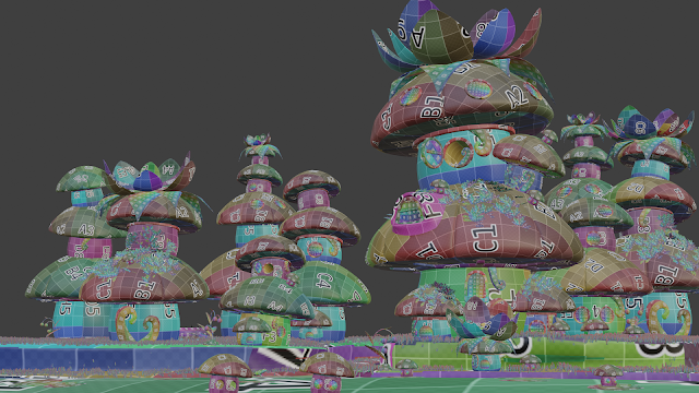
The complementary colours of yellow and purple are used in the mushroom materials.
While making the different materials/textures for the objects in my scene, I tried to make a few objects more prominent. The first object's material changed were the mushrooms, my first decision was to use soft pastel colours: blue, pink, and purple. The problem with the first material was that the mushrooms blended in with the background, it wasn't the main objects in the scene anymore. The next step was to make the colours more vibrant, and to add black. Using black was not originally my plan, but it worked well in the end.
The flowers changed from orange to blue, purple, and peach. The final material was achieved by mixing all of those colours into one material. I wanted to use more complementary colours of blue and orange to make the characters more visible, but that made the scene look dull.
Final Outcome of the Week:
While playing around with unacceptable colours I changed a few of my original plans and created different materials/textures. This helped me to get better materials/textures for the objects. The changes helped me to maintain the main focal point of the scene.

Die is very cool. Hou so aan.
ReplyDeleteBaie dankie, ek sal.
ReplyDelete